KOHO BRANDING
Case Study // March 2018
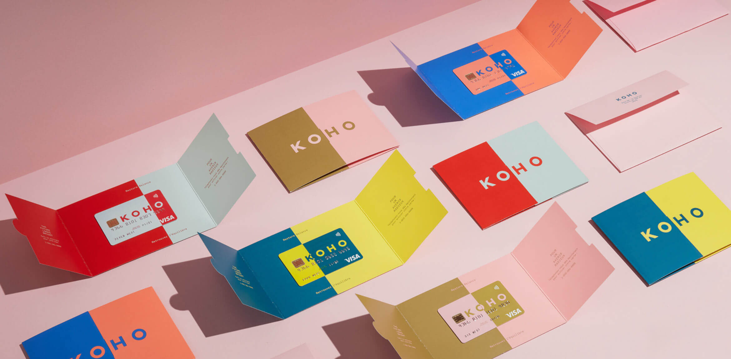
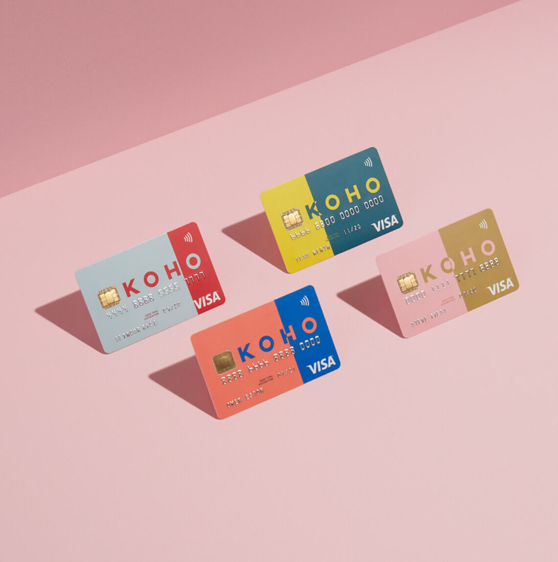
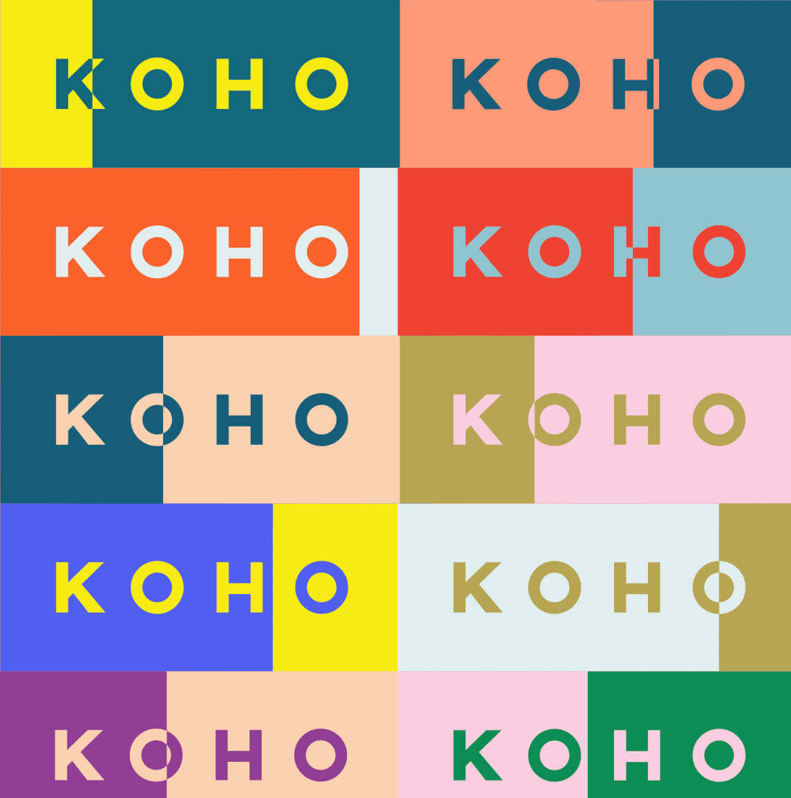
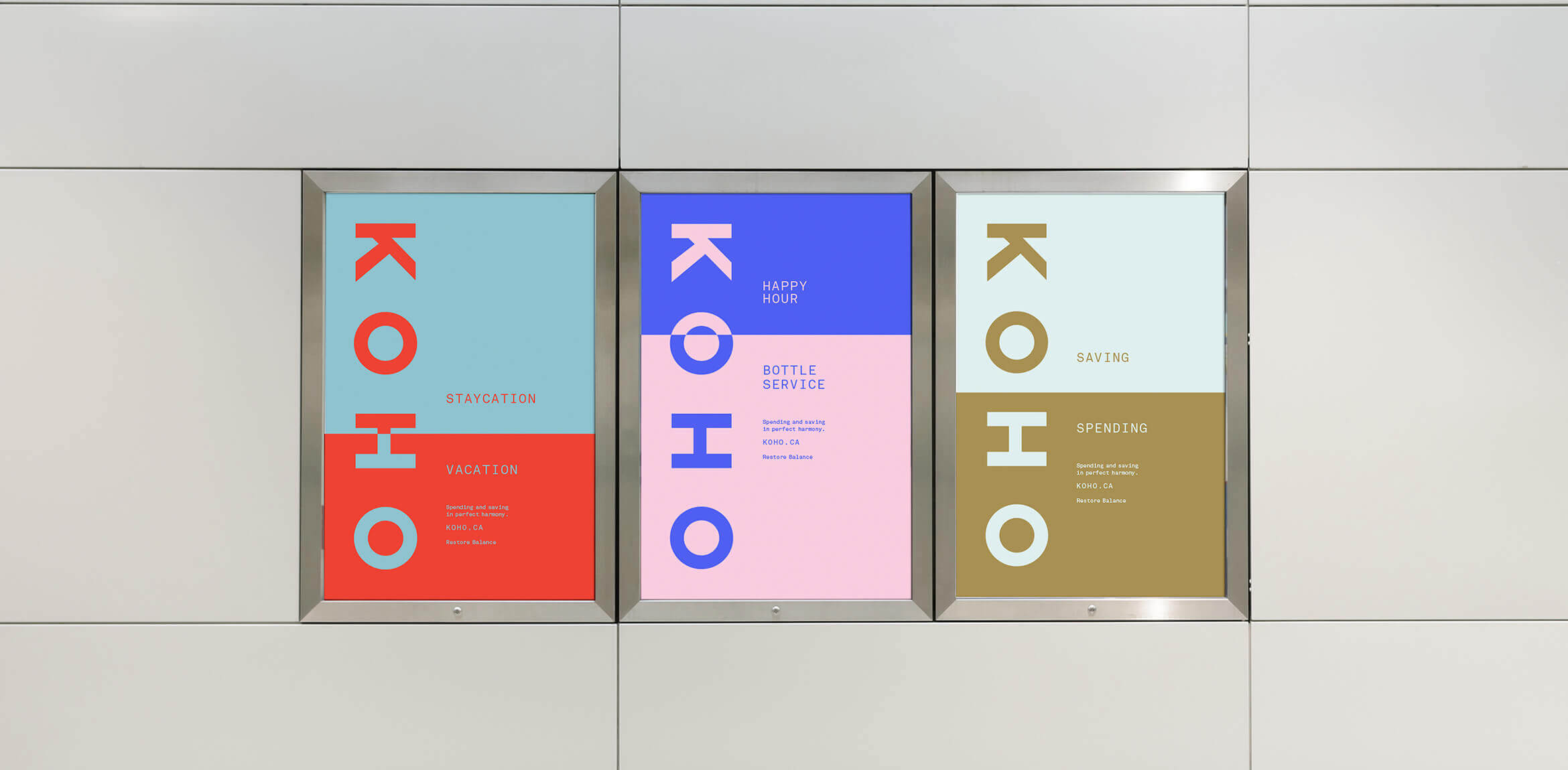
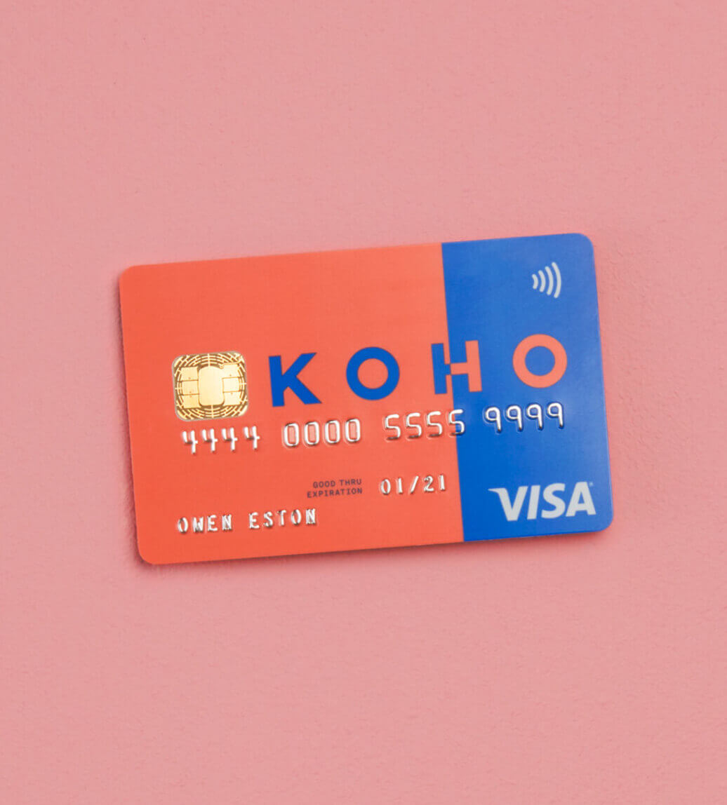
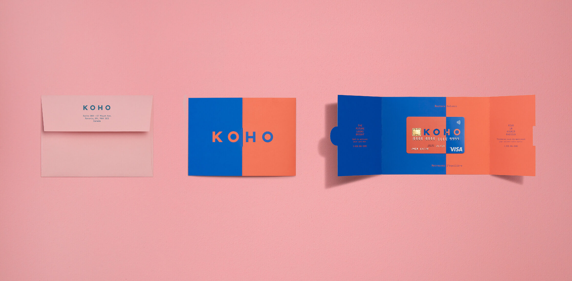
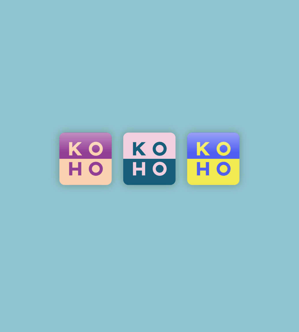
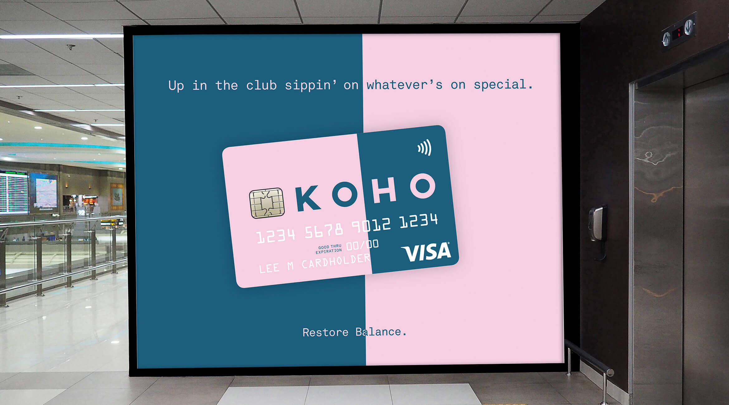
We created a platform for KOHO built on putting financial power back into the hands of the people. At the core, it was about finding balance between spending and saving both functionally and aesthetically. Each logo and corresponding card featured two bold colours in different level of balance, representing how your balance will constantly shift from spending and saving modes.
Created at One Twenty Three West, with Evan Kane.